
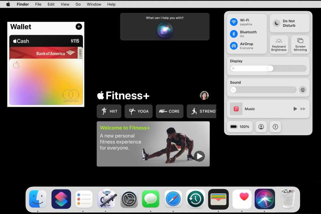
Every year since 2011, Apple has released a new major version of macOS, so we know one is coming this year. But since macOS Big Sur 11 was such a big change for Mac users, Apple may very well decide that the next version (most likely named macOS 12) will mostly focus on fixes and minor feature updates—not unlike Snow Leopard, Mountain Lion and High Sierra, . That doesn’t affect our macOS 12 wishlist, though, except maybe that it gives us a better understanding as to why our wishes may not be granted this year. So when macOS 12 is revealed, here are a few features we hope make the list.
Apple doesn’t wait until a major update like this one to release fixes; they usually address them in point-release updates. But there always seem to be issues that linger. For example, there’s the SSD excessive activity situation that was discovered in February. Even though it may not be as bad as you might think, it still seems like it needs to be addressed.
As for Macs with Apple silicon specifically, can macOS be even faster than it already is? Big Sur was optimized for Apple’s M1 system on a chip, but there’s always more that could be done with performance and battery life, as we’ve seen with every release of iOS. Big Sur on M1 Macs is very impressive, but there are plenty of little issues that cause our MacBooks to drag, lag, and even crash on a semi-regular basis. Honestly, if the next version of macOS focuses mostly on fixes and optimization and nothing else, that’s good enough for us. Everything else is a bonus.
Our friends at Macworld U.K. have this on their wishlist, and we have to agree. One of the iPhone’s best features is iCloud backups, and we’d love to have it be just as effortless on the Mac. Having an offsite backup is good practice to prepare for the worst, and while there are plenty of third-party cloud backup services, nothing beats the ease of use of Time Machine. Hooking up an external drive to your Mac is easy enough, but setting it and forgetting at setup it with iCloud would be wonderful.
Okay, this wish, in the whole scheme of things, is extremely minor. Some might even say it is silly. But it’s an example of how macOS and iOS are merging in many ways, but it should not be forgotten that macOS UX and iOS UX don’t always overlap.
Big Sur brought macOS Messages on par with the iOS version, which is awesome for things like stickers, pinned messages, and Memoji. But there’s one change we hate: Apple removed the “X” button for individual messages next to conversations. Now when we want to delete something, we have to right-click it and then select “Delete Conversation,” or select the message and then go to File > Delete Conversation. Or, if you’re using a trackpad, you can use two fingers and swipe to the left to see the Trash icon.
The Delete button in Messages disappeared in macOS Big Sur. It needs to come back.
IDG
All those options are fine. But we miss being able to quickly hover over a conversation and click the “X” (seen above) to delete it in a snap. (And yes, we know we can create a custom keyboard shortcut, but that’s not the point.) Removing such simple and intuitive functionality was a mistake and we’d like Apple to bring it back, please.
Big Sur’s Control Center—which mirrors the same features in iOS/iPadOS—helps clean up the cluttered menu bar in an intuitive way, but it has very few customization options. Seven of the buttons are permanent, which means the ones you might deem unnecessary (Keyboard Brightness, Display Preferences, Music, etc.) can’t be removed. And there are only three other optional modules you can add.
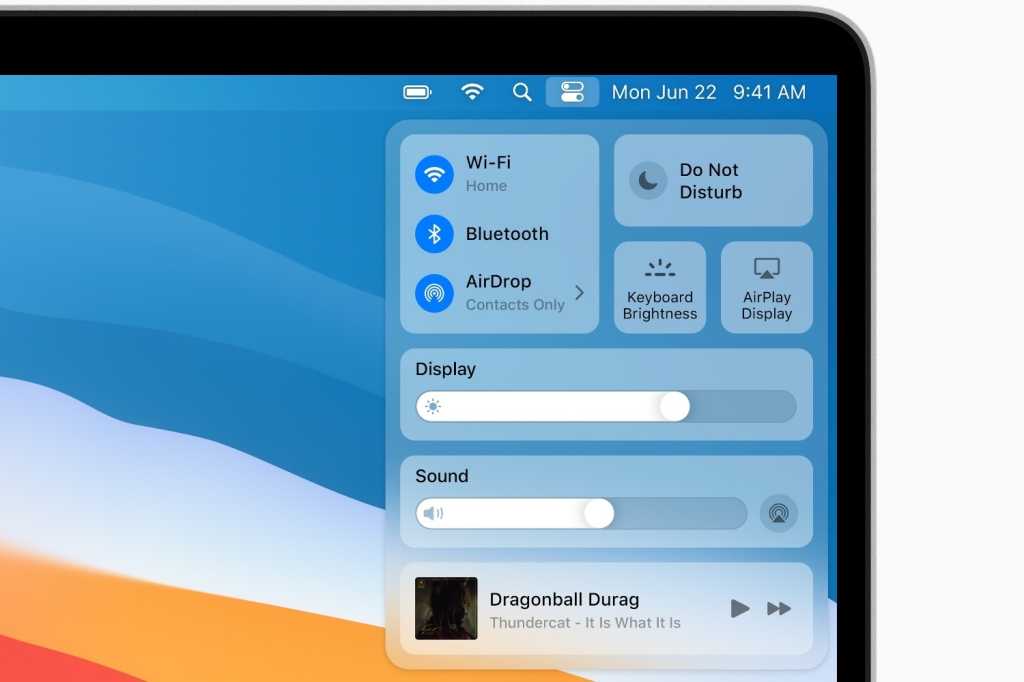
Control Center is a good addition to the Mac, but it needs to be more flexible.
Apple
Control Center needs to be at least as customizable as it is on iOS, where it has more controls available, the ability to remove any modules, and support for Home Controls. It might be too much to ask at this point to allow third-party apps in Control Center, but most of our menu bar icons are for third-party apps, and the option to put them in Control Center would be a nice way to clean things up. But at least allowing more macOS modules is a step in the right direction.
Big Sur brought the same customizable widgets to the Mac that iOS 14 brought to the iPhone, and we’re loving them. Apple also brought them to macOS, but they’re stuck in the Notification Center. We’d love it if Apple would move them out as it did with the Dashboard widgets of old.
Apple released the Shortcuts automation app over two years ago for iOS, and it’s become a truly powerful tool for getting things done. But on the Mac it would be indispensible.
The Mac already has the powerful Automator (that icon in your Applications folder with the cool-looking robot), but it’s old and not as user-friendly as Shortcuts. Shortcuts would be a fantastic companion app to Automator, opening up the world of automation to a lot more users that aren’t looking for the kind of power Automator brings. Plus it would bring the Mac and iPhone ever closer since Shortcuts on the Mac would be able to run the hundreds of Shortcuts already available on iOS. Which is a good segué to the next feature on this wishlist…
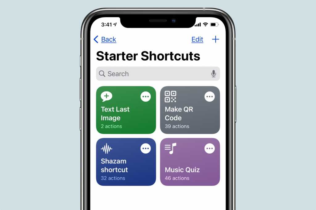
Shortcuts is on iOS, and it needs to come to the Mac.
Apple
Apple continues to tweak its iPhone and iPad app support under Catalyst with each Big Sur update, but there’s still work to be done. Mainly, the UI still often feels like we’re using mobile apps on the desktop, particularly with apps like TV and Music, and there are some performance tweaks that can be made too. And we’d also like to see way more apps make their way over to the Mac, especially if Shortcuts makes an appearance. Without the interoperability with all of those iOS apps, it’s not nearly as useful.
I used to be an old-fashioned, pay-with-cash kind of guy, so I didn’t use the iPhone Wallet app very much. Then Covid hit and many stores stopped accepting cash and moved to touchless payment. So it took a pandemic to bring me into the 21st century and to realize how cool an app Wallet is.
When I shop online, I do it on my Mac, and it would be nice if there was one central location to organize payment accounts, a place that’s more robust than the rudimentary System Preferences pane that can store boarding passes and event tickets, not to mention a place to pay off my Apple Card bill without having to visit card.apple.com or picking up my iPhone.
Apple’s latest exercise service is available on iPhone, iPad, and Apple TV, but not on the Mac. For anyone who doesn’t have an Apple TV, Fitness+ on, say, an iMac or a Mac mini hooked up to a widescreen monitor is a far better experience than using an iPad or iPhone. And while we’re at it, we’d like to see a Mac version of the Health app, too. It’s a head-scratcher that it’s not available yet.
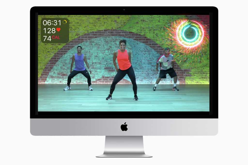
Apple Fitness+ on an iMac seems to make a lot of sense.
Apple
Siri improvements are a perennial choice on every Apple OS wishlist we write. Apple does make a lot of noise about Siri updates every time a new version of macOS or iOS is released, but they never seem like enough. To compete Google Assistant or Amazon Alexa takes constant attention and updates, and we haven’t gotten it yet. We can’t even set simple alarms on our MacBooks yet. It’s time for Siri to make a big leap—and it starts with the Mac.
Roman has covered technology since the early 1990s. His career started at MacUser, and he’s worked for MacAddict, Mac|Life, and TechTV.
24World Media does not take any responsibility of the information you see on this page. The content this page contains is from independent third-party content provider. If you have any concerns regarding the content, please free to write us here: contact@24worldmedia.com

A Brief Look at the History of Telematics and Vehicles

Tips for Helping Your Students Learn More Efficiently

How To Diagnose Common Diesel Engine Problems Like a Pro

4 Common Myths About Wildland Firefighting Debunked

Is It Possible To Modernize Off-Grid Living?

4 Advantages of Owning Your Own Dump Truck

5 Characteristics of Truth and Consequences in NM

How To Make Your Wedding More Accessible
Ensure Large-Format Printing Success With These Tips

4 Reasons To Consider an Artificial Lawn

The Importance of Industrial Bearings in Manufacturing

5 Tips for Getting Your First Product Out the Door